CASE STUDY:
Allegiant Air
Redesign of Allegiant Air's iOS mobile app to solve usability issues, unify the overall branding, and add useful features.

ROLE
UX Research
UX/UI Design
Prototyping
TEAM
Sole UX/UI Designer
TOOLS
Figma
DURATION
August 2022
Overview
Allegiant Air is a U.S.-based budget airline focusing on regional airports and smaller markets. Their mobile booking flow is frustrating due to too many screens and incessant ad interruptions. For this self-directed project, I redesigned their iOS mobile app to solve usability issues, unify branding, and add useful features.
01 RESEARCH
Summary
Research started with a review of two key areas; 1) the core user journey of searching for and booking a flight on the Allegiant Air iOS app, and 2) an audit of Apple App Store reviews for the Allegiant Air app.
Link to Competitive Audit | Competitive Audit Report
Booking flow is too long and too many distracting ads
App Store Reviews
Allegiant Air has one of the lowest-rated airline apps on the Apple App Store with one-star reviews outweighing the other categories. Multiple users cite accessibility issues with the app and a frustrating overall experience.


Mobile App Audit
The mobile app has a number of different issues. The visual branding is inconsistent with a few screens using a dark blue color not found anywhere else on either the app or website and a number of varying button styles leading to poor call-to-action.
The app booking flow is also too long with a total of eight steps. Three of those steps are dedicated solely to advertisements which interrupt the booking flow.


Ethnographic Research
Additional research was also conducted through a site visit to Allegiant Air’s check-in counter at the local airport. This revealed significant check-in lines and escalating wait times for travelers checking bags or having issues accessing a mobile boarding pass.


In a two hour period on a weekday morning, wait times never fell below 15 minutes.


Observed wait times continued to increase during that two hour period. Check-in attendants frequently had to call specific flights to an expedited line to prevent travelers from missing their flight.
Pain Points
Booking Length
Users feel there are too many booking steps and may abandon the booking process.
Accessible Navigation
Users want a way to easily navigate around the app without having to always return to the home screen.
Advertisements
Users feel distracted by the constant ad interruption.
Check-In
Users want a way to tell how long check-in for bags at the airport will take.
02 DEFINE
What Are We Solving?
The goal is to streamline the flight booking flow through a reduction in screens and advertisements (from 11 total down to 5). Clarity is a priority: pricing, call-to-actions, and navigation within the app. Additional usability features like an informative check-in screen and digital boarding pass will also be designed.
03 SOLUTION
Wireframes
The research and review of competitor’s apps beforehand allowed for efficient wireframing of possible solutions. The primary focus of initial wireframes was a reduction in the number of screens needed to complete the booking flow.


Digital Wireframes
Wireframe design emphasizes accessible navigation and clear indication of key screens throughout the booking flow. These solutions address the two primary user pain points of booking length and navigation.

A sliding bottom sheet is used when completing items on a page so users have fewer separate screens in the flow

A bottom navigation bar is present on all primary screens to provide users with easily accessible navigation
Eliminate user frustration by reducing booking flow screens from 11 to 5

04 VISUAL DESIGN
Design System
To create consistency in the design a mobile digital style guide was developed. This would solve the issues with inconsistent brand color identity and poor call-to-actions.
Develop a mobile app style guide to resolve inconsistent branding and poor CTAs

COLOR
The colors used on the mobile app were cross-referenced with the website to check for color brand consistency. The darkest blue used in the app was not found anywhere else on either the mobile app or website and only used on one screen of the app so it was eliminated.
It was quickly apparent Yellow colored text would not pass a contrast checker test if used on a white background and vice versa. Text would need to be either Black or White depending on the background color. Orange can also be used on a White background.

TYPOGRAPHY
A single font style was used to match the font already in place for both logo and copy. Two different weights were used; regular and bold.
The typography scale was based on a 4pt system to allow for maximum flexibility in the design.
BUTTONS & ICONS


Three button styles were created based on the redefined brand color palette and mobile app needs.
For most button components, the Orange colored button was used. This color had the highest contrast against the blue and strongest correlation to call-to-action.
Accessibility Considerations
01
Bottom navigation bar present on all primary screens so users can quickly access key areas of the app.
02
Color scheme and contrast adhere to WCAG standards.
03
Certain screens auto-advance once an option is chosen to reduce the number of confirmation inputs needed.
Breadcrumbs, consolidation of advertisement screens, and a live check-in wait times graph
Mockups
Consistent color branding is used throughout the app.

Breadcrumbs were added to each step of the booking process to better guide users through the booking flow and provide context as to how long it will take to complete.

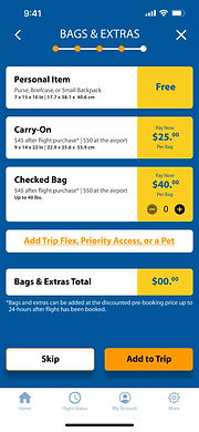
Three separate advertisement screens have been condensed to a single advertisement / Bags & Extras screen as the last step before payment. This fits better in the context of the booking flow and doesn't interrupt users.
A live check-in wait times graph is provided on the check-in screen that gives users real-time updates so they can plan properly. This was added in response to the long check-in lines observed during the site visit.

Final Designs

HOME
FLIGHTS

TRAVELERS

SEATS
BAGS

PAYMENT

CHECK-IN

BOARDING PASS
High-fidelity Prototype
The high-fidelity prototype followed the same user flow as the low-fidelity prototype and aimed to keep the number of screens to a minimum.
Users are guided through the flow with breadcrumbs. Visual branding is unified with a consistent color palette throughout which is consistent with the website. And total steps to complete the booking flow has been reduced from eight to five.
05 TAKEAWAYS
Impact
The flight booking flow in Allegiant Air’s mobile app was successfully reduced from eight to five primary screens thus reducing the likelihood of users abandoning a flight booking. The numerous pages of ads (four) interrupting the booking flow was reduced to one to improve the user experience. A new check-in live wait time graph was created to help users better plan their arrival time at the airport.